Typography that Sells: Hambone Publishers’ Guide to Perfect Fonts
In the hustle of writing, editing, designing and publishing your book, you may not look at the typography as a crucial element. After all, it is just a different type of font, how much can it matter. Well, no, there is a lot to typography.
Typography is more than the font in which your book is written. Essentially, it shapes how readers perceive your message, and also, how well you convey the message. The right typeface aligns with the tone and theme of your script and helps evoke emotions, establish credibility, and even improve your conversions. Whether it’s script typography or serif typography, it should be true to the message you want to deliver. Different types of typography help in the success of your book cover design or branding your business.
What Is Typography?

We have all heard how your handwriting can reveal your personality traits – well, same goes for the typography. It isn’t just the arrangement of words, telling people what is written, it is about the aesthetic appeal and style that reveals the tone and theme of your script. In the publishing industry, the right typography should be readable, should reveal the tone of your script, and should help build brand perception.
Choosing the best-fit typeface effectively conveys your message, and the poorly chosen one sways the readers away. Brands, businesses, and authors make the most of different types of typography to establish trust and identity. For example, you will never see luxury brands using ‘funky’ fonts, they always lean towards serif fonts. Similarly, tech businesses often choose san-serif fonts to convey their message.
Beyond fonts, typography has different aspects such as kerning (space between letters), leading (space between lines), and alignment. These aspects help readers process the information comfortably. The right typography allows readers to not just see the message but feel it too.
Types of Typography
Different types of typography represent different messages and tones, each with its own function and personality. Knowing these distinct types of typography helps us in making informed design choices.
1. Serif Typography
Serif fonts are named after the small strokes at the end of each letter, named as ‘serifs.’ This font is traditional yet has a touch of sophistication to it. You will usually notice this font in newspapers and books. Times New Roman and Garamond are examples of this type of font.
2. Sans-Serif Typography

As the name suggests, this type of font doesn’t have the ‘serif’ at the end of each letter. It is a rather clean and modern type of font. They are popularly used in contemporary designs, business branding, and digital media. Helvetica, Futura, and Arial are examples of sans-serif typography.
3. Display Typography
Display fonts work the best to grab attention, and are typically used in logos, headlines, and different types of branding. This typography has elaborate designs, and unique shapes, making them visually bold.These types of fonts are not suitable for long-form reading, but for creating a strong visual impact. When used strategically, display fonts can effectively convey mood, personality, and brand identity.
4. Monospace Typography
If you have seen the font of a typewriter, then you know this type of typography. Monospace typography puts the same width after every letter, giving a mechanical and tightly structured appearance.
This style is popular in coding, programming, and technical documentation, where precision is prioritized. Given its mechanical outlook, developers are able to identify the errors, missing characters, and keep lines of code aligned. Some of the best monospace fonts include Courier New, Consolas, Fira Code, and Source Code Pro. Each font has clean, readable characters optimized for screen and print use. Besides its popularity in technical documentation, monospace fonts lend a classic look in modern design projects.
5. Script Typography
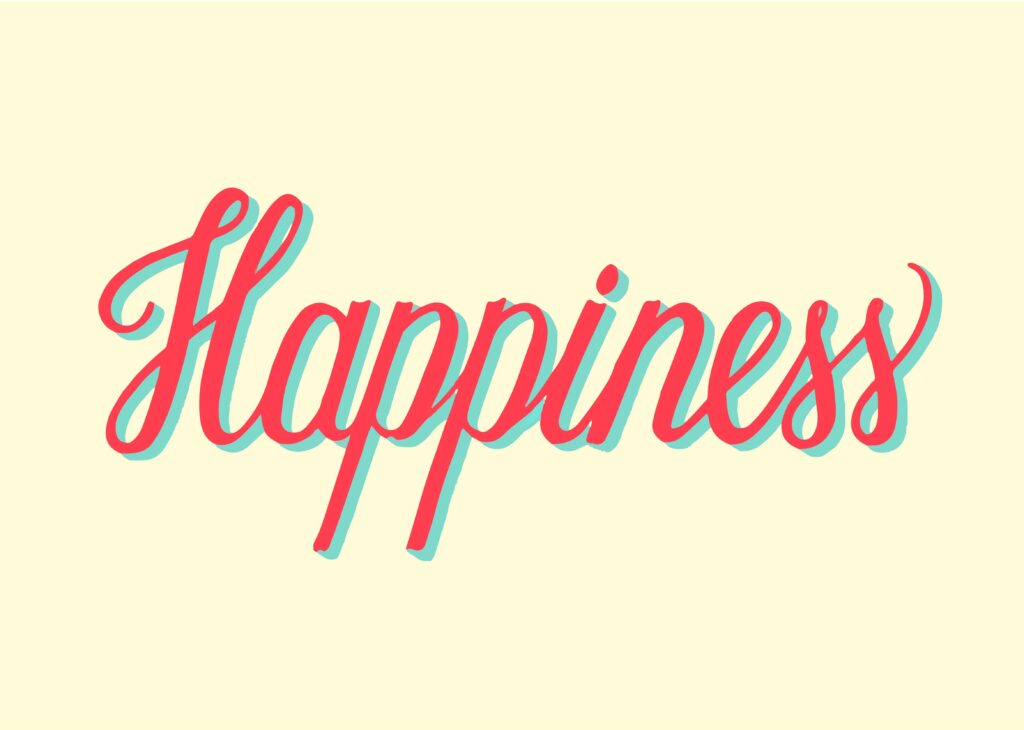
Script typography appears like cursive handwriting, making it elegant and sophisticated. With a touch of creativity and sophistication, script typography is used for artistic projects, brandings, and invitations.
Script Typography: The Art of Elegance
Script typography is the perfect mix of fluidity with style. Most brands use it to bring elegance and charm to their branding. Where serif and sans-serif fonts seem rigid, script typography brings a distinct personality and movement. It often resembles calligraphy or handwritten text.
The two key types of script typography are:
1. Formal Scripts
Formal scripts have strokes and flourishes that look like calligraphy text. They exude luxury and sophistication, making them ideal for wedding invitations, branding, and book covers. Bickham Script and Edwardian Script are examples of formal script.
2. Casual Scripts
Casual scripts mimic handwritten text and seem more relaxed. They are usually used in social media, informal invites, and branding. Pacifico and Brush Script are examples of casual scripts.
Choosing the Perfect Font for Your Brand
Choosing the right typography from different types of typography may seem daunting, but there are a few aspects that you should consider before choosing the perfect font for your brand. Consider the following:
- Audience: Who is your target audience? A playful font will attract a younger audience, while a modern serif will attract professionals.
- Legibility: The font should be easy to read in different sizes. Avoid using decorative typography for body text.
- Emotional Impact: Fonts have an emotional impact. Sans-serif conveys strength, and the script font conveys luxury.
Brand Consistency: Avoid using a plethora of fonts while branding, stick to a few fonts to maintain a cohesive look across all materials.

Final Thoughts
Typography builds the perception. A well-chosen typography will convey your message more effectively, help build trust, and significantly improve engagement. Whether you choose sans-serif or script make sure that your typography aligns with your voice and purpose.
At Hambone Publishers, we believe in the power of perfect fonts. Choose wisely, and let your typography speak volumes!
Contact
- +1 (936) 223 3644
- [email protected]
- 8858 State Hwy, 146 South Livingston, Texas, 77351

100% SATISFACTION
Our services are 100% confidential. We Strive for 100% satisfaction.


ACCEPTED PAYMENT METHODS

Copyright 2025 Hambone Publishers All rights reserved.
Contact
- +1 (936) 223-3644
- [email protected]
- 8858 State Hwy, 146 South Livingston, Texas, 77351

100% SATISFACTION
Our services are 100% confidential. We Strive for 100% satisfaction.

ACCEPTED PAYMENT METHODS

Copyright 2025 Hambone Publishers All rights reserved.


